The Power Of X
A simple yet powerful lighting technique anyone can master in under a minute.
A simple yet powerful lighting technique anyone can master in under a minute.
Summary: Ryan reveals three simple steps used to deliver great looking videos on Indie Cinema Academy.
Length: 17:59 minutes

** You must be an Advanced or Pro Access member for article video downloads. **
We’ve been getting a lot of requests to share how we deliver great looking video for our web content. In this short video, I’ll walk you through the three steps we take to ensure that our productions continue to look great after being uploaded to online video platforms such as Vimeo and YouTube.

Ever heard the term “garbage in garbage out”? It means that your end deliverable is never going to be any better than what you started with. That’s why delivering great looking video all starts by getting your look in-camera. Our videos at Indie Cinema Academy are 80 – 90% of the way to the final image since we do so much in-camera.

You could literally take our raw footage and use it for delivery and it would still look good.
The first step is ensuring that our cameras are set up correctly. All of the camera settings need to match the format of our end deliverable. For example, if we are delivering at 23.98 fps, then we shoot at 23.98 fps–not at 24 fps, 25 fps, or 29.97 fps. We also perform a manual white balance to a real gray card or white card. This eliminates any potential colorcast from our key light. I’m not going to bore you with how to set the tons of settings camera’s have; we have a separate video that details the four steps to cinematic video, which covers camera settings. In short know what your end deliverable is going to be, then set up your camera accordingly.
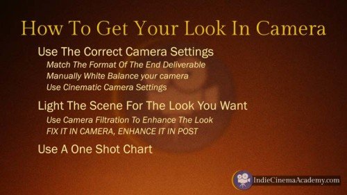
The second step to getting the look in-camera is lighting your scene the way you intend it to look, and using camera filtration to enhance that look. If you find yourself regularly fixing things in post, your images are going to suffer. Our mantra is: “Fix it in camera, enhances it in post.” If your lighting doesn’t look right in camera, then it isn’t going to look any better later in the process. Everyone’s lighting style and approach is going to be different, so it isn’t about style; what’s important is that you’re capturing that look in-camera. Personally I prefer a big soft key light, with hard lights peppered around as accents.
To learn more about lighting and camera filtration, come on over to the membership side where we cover that in much more detail.
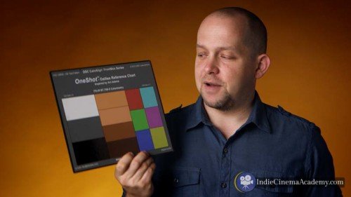
The third and final step to getting the look in-camera is this little gem: the One Shot Chart. After I have my scene lit, I’ll bump off a 2 – 5 second clip of this chart being held in the key light. While charts are not sexy, this one is quick and easy to use in real production environments. It was specifically designed for this type of use, so I don’t worry about critically lighting it.
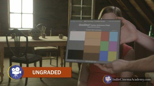
All I have to do is hold it in the key light for every lighting set-up, making sure the gray patch falls at the correct level for my current camera profile. For example if I’m shooting in log, that will be around 30 – 40 IRE on the waveform; if I’m not in log it will be somewhere between 40 – 50 IRE. The specific number depends on the camera, so read the manual.
Now that you have captured your footage and it is about 80 – 90% of the way there, it is time to take it that last ten to twenty percent. This is where you’ll use your grading software and your short clips of the One Shot chart to polish your work.

I’m going to quickly show you how we do that in Final Cut X and I’ve put together a separate video showing how to do that in Resolve. So lets jump on in shall we?
Alright so I’ve got Final Cut X launched here and I’m going to walk you through a quick overview of my grading process. I’m going to go into a lot more detail on this when I do some training on the One Shot Chart. So this video is just the highlights. It’s quick and down and dirty so that this video doesn’t drag on too long.
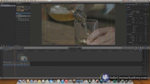
So let’s pretend that this clip here has been edited and it’s in my final edit. And I’m all ready to go; it’s been locked down. And now I need to grade it. So I’ll bring in the shot of the one shot. Here is the clip that has the One Shot Chart in it. The first thing I’m going to do is to make life easy on myself. Because grading is tough enough, why not make life easier by making this chart fill the frame. Now it is going to be a lot easier when I take a look at this on the scopes to see where everything falls. So let’s bring up the scopes, and now here we are.
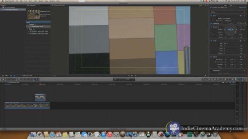
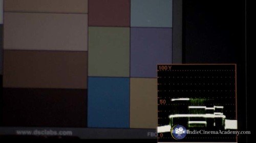
Ok, so how this works: I’ve got my RGB overlay, settings in here, this is how I prefer to have my vector scope, sorry not my vector, my waveform set up with the overlay. I find this a lot easier than the parade.The parade: some people really like this, I don’t. But that’s just me. So back to the overlay. So how this works is that when all of the color channels are lined up, they make a white line. When they are not lined up you can see the individual color channels themselves. So red, green, and blue.
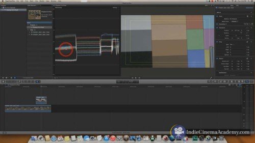
So even though I white balanced this camera, using the back of this One Shot Chart, you can see that the color channels are separated some. We need to bring those into alignment to finish out the white balancing process.
So I’ll bring in Correction 01, and I need to jump over to the color tab. Now that I have color, I’m going to start with my whites or my highlights. And I’ll bring those around until they kind of line up here. There we go. Kind of just dance that around.
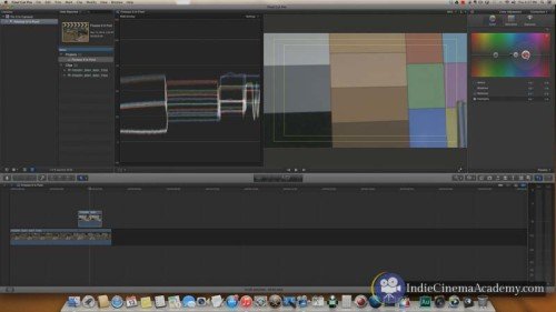
Those of you who work in Final Cut X know how touchy this is, which is all kinds of fun! Yeah! Now I’ve got my shadows, and I’m going to do the same here. Move that around until I have a nice white line. Now as you take a look at this, you can see that the mid tone is pretty well balanced. I’ve got a nice white line there after working with the shadows and the highlights. If I wanted to do a little bit further tweaking I can take my mid tones and see if I can get that any closer. And oop, there it is. Cool, so I’m fairly well balanced. I’m going to go back to my shadows here, because it feels like they fell out a little. So I’ll adjust those until they pop a bit more. Cool, so now I am all white balanced with my mid tones, which I think is highly important. Now that I’ve got my clip white balanced, I am jumping out here to show you before and after. So if you’re looking on here, you can see that the image before it is white balanced is a little bit cool. And now that it is technically white balanced it is warmed back up.
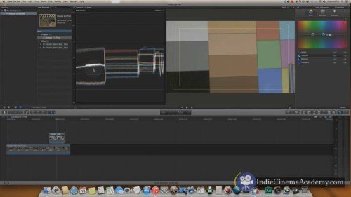
The next step in the process is to put my exposure where I want it. So this was shot with a canon using canon log. Which should have been around 32 IRE, and that’s where this lives at about 32-ish. So I jump over to my exposure tab and grab the global puck here and I move that up. I’m going to move that up so that it falls somewhere in-between 40 – 50 IRE. Where it falls is… technically it should be around 40, maybe 46, a lot of it has to do with personal taste. Me, I like to be somewhere below 50 let’s go about there.
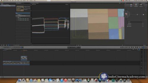
As you can see this chart is not evenly lit that’s why this line goes higher. I’m not going to perfectly light a chart in the middle of a shoot. But that’s ok for this one shot chart.
And now I’m going to take my shadows, and grab that puck and lower that down until that black chip there feels about right, which will be right about there. There we go- that feels good. Now I’m going to adjust my highlights and I’m going to bring those up. Technically those should be at 90. I’m not going to place it at 90 exactly. I’m just going to rough it in. I’ll go into more explanation on this in the One Shot Chart training. This is just a quick little overview. And we’ll put that there.
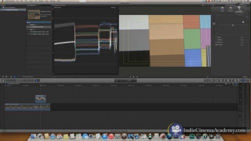
Now I’m taking a look at this and my mid tone has crept a little bit higher then I want it, so I’m going to back that off just a touch here. There.. oh, come on, there we go. So now that feels better, I’ve got my exposure where I want it. I’ve got my color balance where I want it. And through adjusting my exposure my saturation levels have actually increased. And even though this is in log and I haven’t touched my saturation, I’m not worried about that at this point. I’m going to go back, if it will let me. Now I’m going to go to my transform tab and I’m going to reset that. And now taking a look at the whole shot here, the shot feel pretty good.
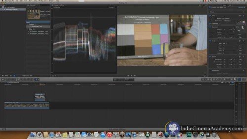
So now I’m going to copy that grade and now I can apply this grade to any other shot that I did for this scene or for this setup. It makes this whole process pretty easy and pain free. So I’m going to go over to the original shot that we wanted to use. And I’m going to paste that into the edit here. And get rid of that clip. And now we’ve got our clip all nicely balanced and graded, but we are not done yet. Of course not, that would be too easy.
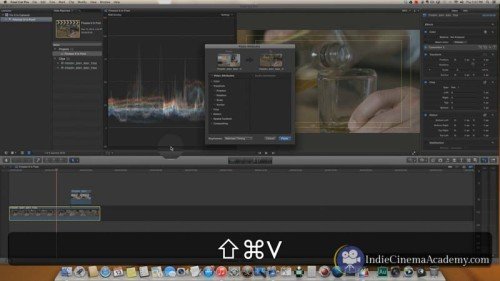
The next step, now that I’ve got my balancing grade which I always do in Correction 01, I’ll add a second correction. This second correction is usually to bring attention to skin tones. I like my skin tones to look good and look pleasant. So the first thing I’ll do is to select them out using a color mask. So I’ll select that tool and I’ll drag this out until I’ve got as much of the skin tones selected as possible. That is a bit to much, so I’m going to back that off so that I have a happy little medium here.
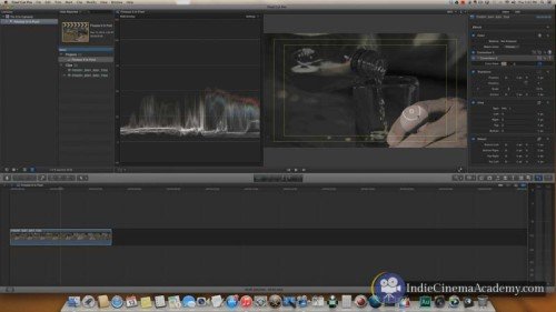
So now I’ve got the majority of his hand selected. And if I wanted to get really fine, I could add another mask here, a little shape mask, around, and that would limit it to just this area. But this is just quick and dirty, so I’m not worried about that.
So I’m going to hop on into the correction and make sure I’m in the exposure tab. And now I want to draw a little more attention to the skin tones and make them feel better. So I’ll do that through creating a little bit of contrast. I’ll create contrast by adding some highlights, there we are. Oops, there we go. Now I’m going to lower the mid tones just a touch here. And now I’ll raise the highlights a little bit more. As you color grade it is all about bouncing back and forth. Every control affects every other control. So as you adjust one, you go back and adjust the other.
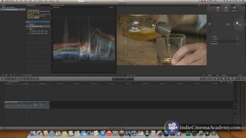
Now that I’ve got that set, the next thing I am going to do…
[motorcycle rumble] Sorry I’ve got some traffic out there, as motorcycles zip by.
So now I’ve got my color tab selected, I’m going to add a little bit of warmth here. Just to warm up the skin tones. All of these values here are living in the mid tone range. So I’m going to grab the mid tone puck, and slide it on over. And to add some warmth into it I want to add some orange, red, kind of up in that neck of the woods. So I’m going to drag this over just a touch.
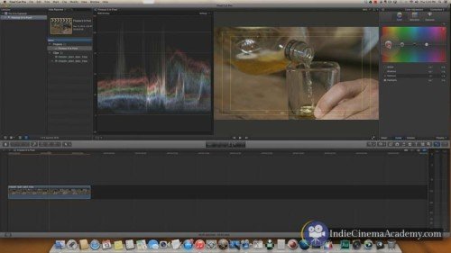
For me, it is all about finessing. It’s not about making someone look like an Ompa Loompa. That’s when things look really fake. And so I’m not interested in that. But I do want to subtly warm it up. So I’m going to add just a touch of orangish-red in here. That was just a little too much for my liking. So I’m going to back it off just a touch. There we go.
Alright now let’s see what I’ve done with the before and after. So this is the before, if it will click; there we go. As you can see as I turn this on and off the skin tones brighten up, and I get a little bit more life into them. It is also affecting some of this bottle in here, and some of this wood. If I wanted to isolate it, again I’d just add that mask.
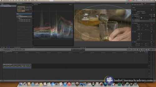
And now the last step of this process is that I’ll add one more correction. This is going to further help add some more focus to the image. I’m going to add a vignette through adding a shape mask. I’m going to make that shape around what is important in this shot. And what’s really important in this shot is this drink being poured. A little bit of whisky- I always like that. I’m going to select the outside. This is the outside of the mask, the feather part if the mask. The softer this is the further out it will be. The harder it is the closer it will be. And I want to hide it and make it subtle, so I’m going to make the vignette fairly soft. And make sure I’m centered up around what is important in the shot.
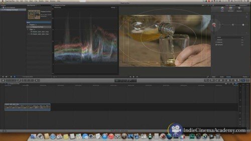
Now I’ll jump on in to the correction. And in here I’ll select the outside because that’s what I want to affect. I’m in the color tab, that’s not going to do me any good. So let’s go on over to the exposure. Now there are a bunch of different ways I can play around with this. I could individually adjust the shadows, mid tones, highlights. I could do that with these pucks here. But I’ve found it easier to just grab the global puck and bring that down. And it’s all about subtlety. So I’m not going to go extreme; that doesn’t look good. But it is just a touch there to add a little bit of focus to the shot.
And now I’ll jump back over and turn this correction on and off. And as you can see as I turn the correction on and off it adds just a little additional focus. It brings your eye to the bottle here. And again that is the whole purpose of that little vignette. Don’t go to far.
And I’ll scroll through that whole shot just to see how that correction plays on the entire shot. And it all looks nice and good. Now I’m done with my grade and I can move on to other things.
The last step to delivering great looking video to the web is to ensure that your video is compressed correctly. Compression is a bit of a dark art as it entirely depends on the content that you are using. A scene with a lot of detail is going to require different settings than a scene with little detail. This can be frustrating because, if you’re like me, you don’t want to spend countless hours finding the best setting for each video. So here is the secret settings that we use on all of our videos, which work regardless of the video content: ProRes Proxy.

That’s right, you heard me correctly: ProRes Proxy, left at the default settings. On our site you’ll find 6k, 5k, and 4k RAW footage that’s been compressed this way as well as H.264, AVCHD, and XAVC 1080p footage, all delivered in ProRes Proxy for streaming on the web.
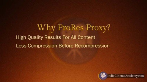
We deliver it this way for two reasons: first off it gives high quality results regardless of the original content. We don’t have to waste time dialing in specific settings for every clip. Secondly when you upload your footage to Vimeo, YouTube, or some other streaming service, they take it and recompress it anyway. So it makes a lot more sense to give them the highest quality source material possible and let their system compress it to whatever format they want to use. It seems rather silly to give them highly compressed H.264 footage to recompress, but that is just me.
It is worth noting that there is one drawback to delivering ProRes Proxy footage to Vimeo and YouTube. ProRes Proxy is a substantially larger file, so it will take more time to upload and more time for Vimeo and YouTube to recompress it. So if speed is your highest priority, then you’ll want to upload H.264 files. But if you’re like me, and quality is the highest priority, then go with ProRes Proxy.

As long as you create your look mostly in-camera, followed by finessing that look through the grade, and finally delivering the least compressed video possible for delivery to the web, you can be assured you’re video is going to look its best.
If you have any comments or questions about this process, join the conversation by posting them below.
You must be logged in to post a comment.
This site uses Akismet to reduce spam. Learn how your comment data is processed.
This site uses cookies. By continuing to browse the site, you are agreeing to our use of cookies.
AcceptHide notification onlySettingsWe may request cookies to be set on your device. We use cookies to let us know when you visit our websites, how you interact with us, to enrich your user experience, and to customize your relationship with our website.
Click on the different category headings to find out more. You can also change some of your preferences. Note that blocking some types of cookies may impact your experience on our websites and the services we are able to offer.
These cookies are strictly necessary to provide you with services available through our website and to use some of its features.
Because these cookies are strictly necessary to deliver the website, refusing them will have impact how our site functions. You always can block or delete cookies by changing your browser settings and force blocking all cookies on this website. But this will always prompt you to accept/refuse cookies when revisiting our site.
We fully respect if you want to refuse cookies but to avoid asking you again and again kindly allow us to store a cookie for that. You are free to opt out any time or opt in for other cookies to get a better experience. If you refuse cookies we will remove all set cookies in our domain.
We provide you with a list of stored cookies on your computer in our domain so you can check what we stored. Due to security reasons we are not able to show or modify cookies from other domains. You can check these in your browser security settings.
We also use different external services like Google Webfonts, Google Maps, and external Video providers. Since these providers may collect personal data like your IP address we allow you to block them here. Please be aware that this might heavily reduce the functionality and appearance of our site. Changes will take effect once you reload the page.
Google Webfont Settings:
Google Map Settings:
Google reCaptcha Settings:
Vimeo and Youtube video embeds:
You can read about our cookies and privacy settings in detail on our Privacy Policy Page.
Privacy Policy
Isn’t ProRes proxy a mac only compression? What do you suggest for PC editors using Premiere Pro CC?
I’d still recommend ProRes, but you’ll have to install it via a plug-in like: http://www.miraizon.com/products/codecsoverview.html
great, thanks!
I stumbled on your site on NoFilmSchool and I have not been able to go off it for two days. I have learnt so much here. Though I can not afford your full membership I have learnt, even from short videos and free stuffs. Thank so much and keep the flag flying. Good job
Thank you for your comments! Glad you are enjoying the site! Be sure to practice what you are learning, using whatever camera you have.
I’m glad to hear you are enjoying what you are reading and watching. 🙂 If you haven’t done so already, sign up for the FREE Insider Access and we’ll let you know when we publish new articles and other free content. (Sign up for that here: https://indiecinemaacademy.com/membership/ )